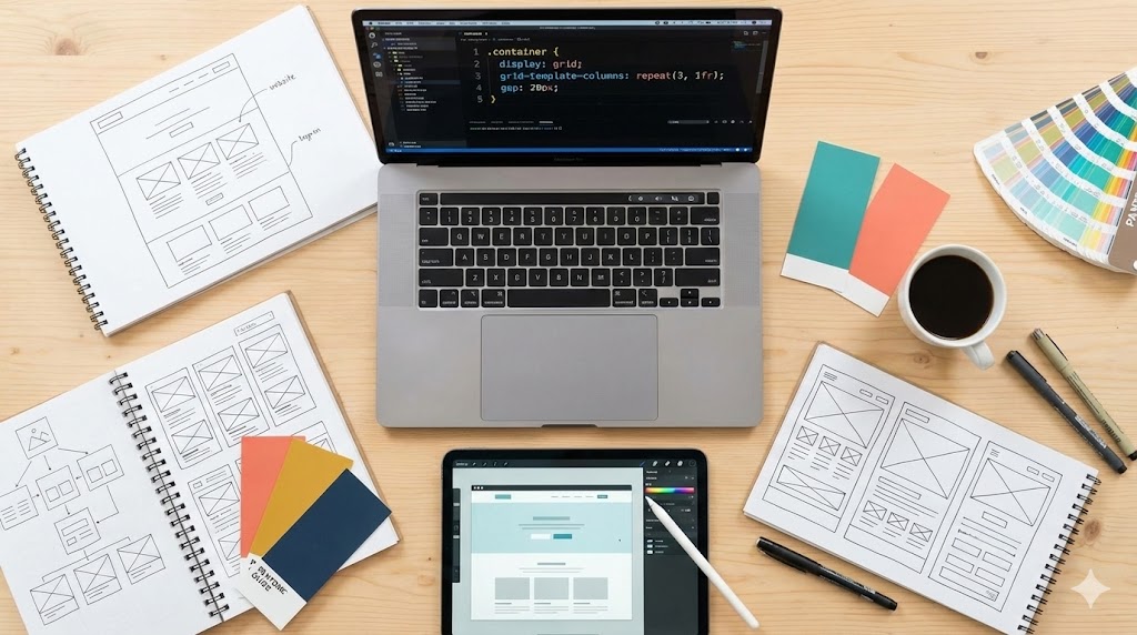
In 2026, amidst AI and advanced tooling, we still cling to a print-era relic: 'Pixel Perfect.' This concept is not only unrealistic but actively harmful to the products we build. Let's explore why it's failing and what should replace it. You can find the foundation for this discussion in this Smashing Magazine article.
Why 'Pixel Perfect' Fails the Modern Web
- It's Fundamentally Vague. What does 'implement this pixel-perfectly' actually mean? Colors, spacing, alignment, shadows? If the answer is 'everything,' that's the core problem.
- Ignores Multi-Surface Reality. With foldable phones and spatial interfaces, a 'standard screen' is a myth. A design perfect on one set of pixels is inherently imperfect on another.
- Assumes Static Content. Mockups are snapshots with specific text. A button perfect for English will break its layout in German or CJK languages, not to mention dynamic data.
- Clashes with Accessibility. If a layout breaks when a user increases font size or uses high-contrast mode, it's not perfect—it's broken. Pixel perfection often prioritizes aesthetics over function.
- Creates Technical Debt. Chasing the last pixel leads to 'magic numbers' like
margin-top: 13pxsprinkled throughout the codebase, creating fragile, hard-to-maintain architecture.
Implementing Intent, Not Pixels
The solution is to focus on 'Design Intent' rather than static values.
- Speak in Tokens: Using design tokens like
--spacing-largeinstead of32pxsyncs logic, not just values, ensuring consistent relationships. - Embrace Fluidity as a Feature: Modern CSS tools like
rem,clamp(), and Container Queries treat flexibility not as a bug to be tamed, but as the web's greatest strength to be implemented. - Use Better Language: Replace 'pixel perfect' with more precise, productive phrases:
- "Visually consistent with the design system."
- "Matches spacing and hierarchy."
- "Preserves proportions and alignment logic."
- "Has acceptable variance across platforms."

Conclusion: The New Standard of Excellence
The web was never meant to be a static gallery. It's a fluid, adaptive medium. Clinging to 'pixel perfection' is like trying to leash a hurricane. A note to designers: Don't hand over a fixed width; hand over a set of rules. Define what stretches, what stays fixed, and what happens on overflow. Your perfection lies in the logic you define, not the pixels you draw. Stop counting pixels. Start building intent.